A new face for Eseleos
We’ve been working on this new website for a while, and now we can finally share it.
The old one wasn’t bad. It just didn’t feel like us anymore. The company has changed, the way we work has changed, and the site was a few years behind. We rebuilt it so the first thing people see matches who we are now, not just to make it prettier.
We also wanted to create something that would grow with us. A website shouldn’t only represent the present, it should be flexible enough to support what’s coming next.
Three directions
We started in low fidelity, just figuring out what goes where and making sure all the sections we needed were there.
Instead of polishing the very first idea, we deliberately explored three completely different visual directions. Each one represented a different personality for the brand, allowing us to compare not just layouts, but also emotions.
Once the structure felt right, I took it into Figma and designed three full versions so we could see them side by side and pick the best one.
-
Modern. The first one is clean and quiet. Minimal typography, generous white space, and a strong focus on clarity. It feels professional, confident, and timeless.
-
Bold and fun. The second direction takes the opposite approach. Strong colours, expressive shapes, and much more energy. It feels playful, memorable, and full of personality.
-
Illustrated. The third concept is softer and more editorial. Hand-drawn illustrations, warmer colours, and layouts that breathe differently from one section to another. It feels approachable and human.
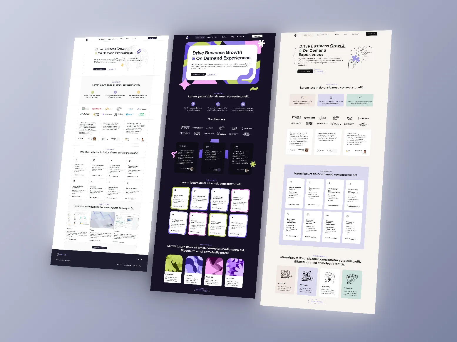
Seeing the three concepts next to each other made the decision much easier. Rather than choosing between “good” and “bad” ideas, we were choosing which aspects of our identity mattered most.
Letting the company vote
One thing was clear from the beginning: we didn’t want this decision to belong to one designer. We wanted the site to feel like it belonged to everyone, not just whoever was designing it, so when those three were ready we sent out a poll.
People ranked them and left comments, and that was the best part: people said the modern one was the cleanest, but the illustrated one felt more human, and we didn’t want to lose some of the shapes from the bold one. Modern won, but nobody wanted only that.
So what we ended up with is a new design: still basically the modern one, but with the best parts of the other two worked in. That was probably our biggest lesson during the redesign: feedback doesn’t dilute good ideas, it often makes them stronger. The final website isn’t one of the three concepts. It’s a fourth design that couldn’t have existed without everyone’s input.
Evolving the logo
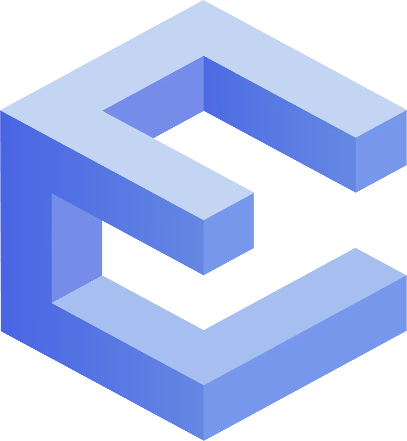
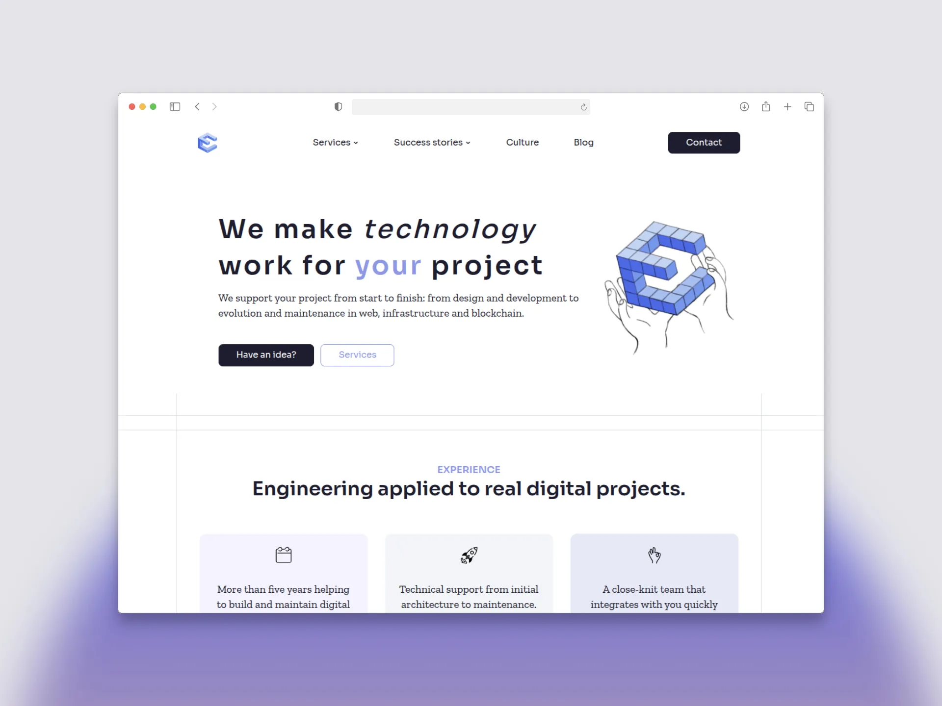
A new site deserves a logo that doesn’t feel five years old. We kept the old logo because we still liked it and only cleaned it up: simpler shapes, fewer lines, and a blue palette that looks fresh. It still feels like us, just a bit more grown-up. It also had to work as an avatar, a favicon, and inside the UI without getting in the way.
Refreshing the logo wasn’t about reinventing our identity. It was about simplifying it so it works everywhere, from a tiny browser tab to large presentation slides, while keeping it instantly recognisable.
The hero animation
This is the first thing you see on the homepage, and I wanted that spot to have a human touch, not just use a stock image or static illustration.
I started from a simple sketch of the basic motion we were going for, and animated it by hand, frame by frame. But the first version still needed a bit of work. The team wanted another beat of motion, so we tried different colours, adjusted the timing, and went back and forth until it felt right. It ended up as a small GIF so it loads fast and loops on its own. We’re really happy with how it turned out.
It’s a small detail, but sometimes those are the elements people remember most. The animation gives the homepage a little personality before anyone has even started reading.
What we learned
Looking back, this project reminded us that good design isn’t about making things look different, it’s about making them feel right.
A few things stood out during the process:
- Exploring several ideas leads to better decisions than polishing the first one.
- The best feedback often comes from people outside the design team.
- Small details, like a subtle animation, can make a surprisingly big difference.
- A company’s visual identity should evolve alongside the company itself.
This redesign isn’t the finish line. It’s the beginning of the next stage of ESELEOS, and we’ll continue refining our digital presence as we keep growing.